American Advertising Awards Gold Winner
-----------
United We Care is Hallmark’s annual fundraising campaign supporting the United Way of Greater Kansas City. Built around the real challenges faced by families in our community, the campaign aimed to inspire empathy, awareness, and meaningful participation among Hallmark employees.
The program centered on three touchpoints throughout company headquarters: immersive large-scale installations highlighting community needs, testimonial posters sharing personal reasons for giving, and a video series that extended those stories across internal channels. Working with a lean budget, I helped develop the core concept and led the creative collaboration needed to bring the campaign to life across multiple disciplines.
-----------
Project Scope:
• Campaign concept development
• Cross-functional collaboration
• Art direction & creative leadership
• Presentation / sell-through
• Design & fabrication
Britax has spent decades leading the industry in car seat safety — but in a crowded baby-goods market, their brand story wasn’t reflecting the strength of their heritage. They partnered with Blacktop to refresh their visual identity and clarify how the brand shows up to parents.
Rooted in their legacy of research and protection, we developed the OVERPROTECT design platform — a bold, trust-driven system that positions Britax as the brand parents rely on. The system extended across ads, web assets, retail materials, and a comprehensive brand guide to ensure consistency moving forward.
-----------
Project Scope:
• Branding & visual ideation
•. Campaign & content design
•. Brand guide design
When I relocated from St. Louis to Kansas City without an existing network, I wanted to introduce myself in a way that felt memorable and authentic. Rather than relying on cold outreach, I created a self-promotional mailer that presented myself as a brand and distilled key highlights typically found in a resume.
The piece unfolded from a tactile, thoughtfully designed package into a wall-ready poster, with every element directing recipients to my portfolio site for a deeper look at my work. The project blended storytelling, identity, and physical experience — turning a career transition into a creative expression of who I am as a designer.
-----------
Project Scope:
• Concept development
•. Branding & visual ideation
•. Pre-production
Much of my recent work centers on designing digital experiences in the highly regulated pharmaceutical and healthcare space — where every decision must balance creativity, clarity, compliance, and compassion for the end user. Working closely with strategy, UX, medical, and development teams, I’ve helped create bespoke, user-centered websites that guide people to the information they need with confidence and ease.
This work ranges from focused single-page splash sites and campaign landing pages to deep, content-rich ecosystems with 100+ pages and complex navigation. Across each project, my role has focused on modernizing legacy brands, strengthening visual systems, and building experiences that feel contemporary, accessible, and aligned with how people browse and interact today.
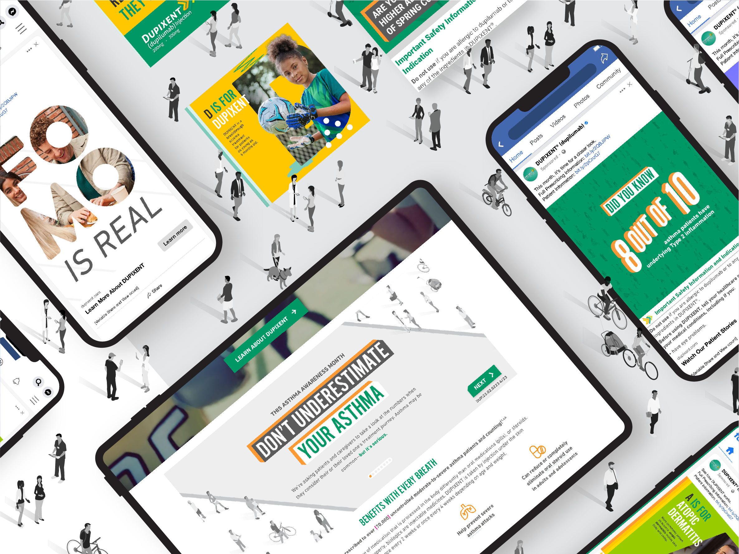
This collection highlights social media ads developed for the highly regulated pharmaceutical industry, spanning multiple indications and audience groups. Working within strict compliance and medical review requirements, each piece was designed to communicate clearly, responsibly, and with a human-centered tone — while still maintaining strong visual impact and brand consistency.
Across these ads, the creative explores a range of messages and campaign expressions, from awareness and education to support and engagement. The work reflects a careful balance of strategy, storytelling, and regulation — ensuring that every execution not only meets rigorous standards, but also connects meaningfully with the people it’s designed to reach.
American Advertising Awards Silver Winner
-----------
I’ve had the opportunity to design multiple show posters for the Kansas City Repertory Theatre, contributing to productions across several seasons. These projects allowed me to lean into conceptual storytelling and expressive visual thinking. These posters were created as a cohesive seasonal series with a unified visual language and were recognized with KC AAA Silver Awards.
Project Scope:
• Concept development
•. Creative strategic thinking
• Design
• Presentation / sell-through
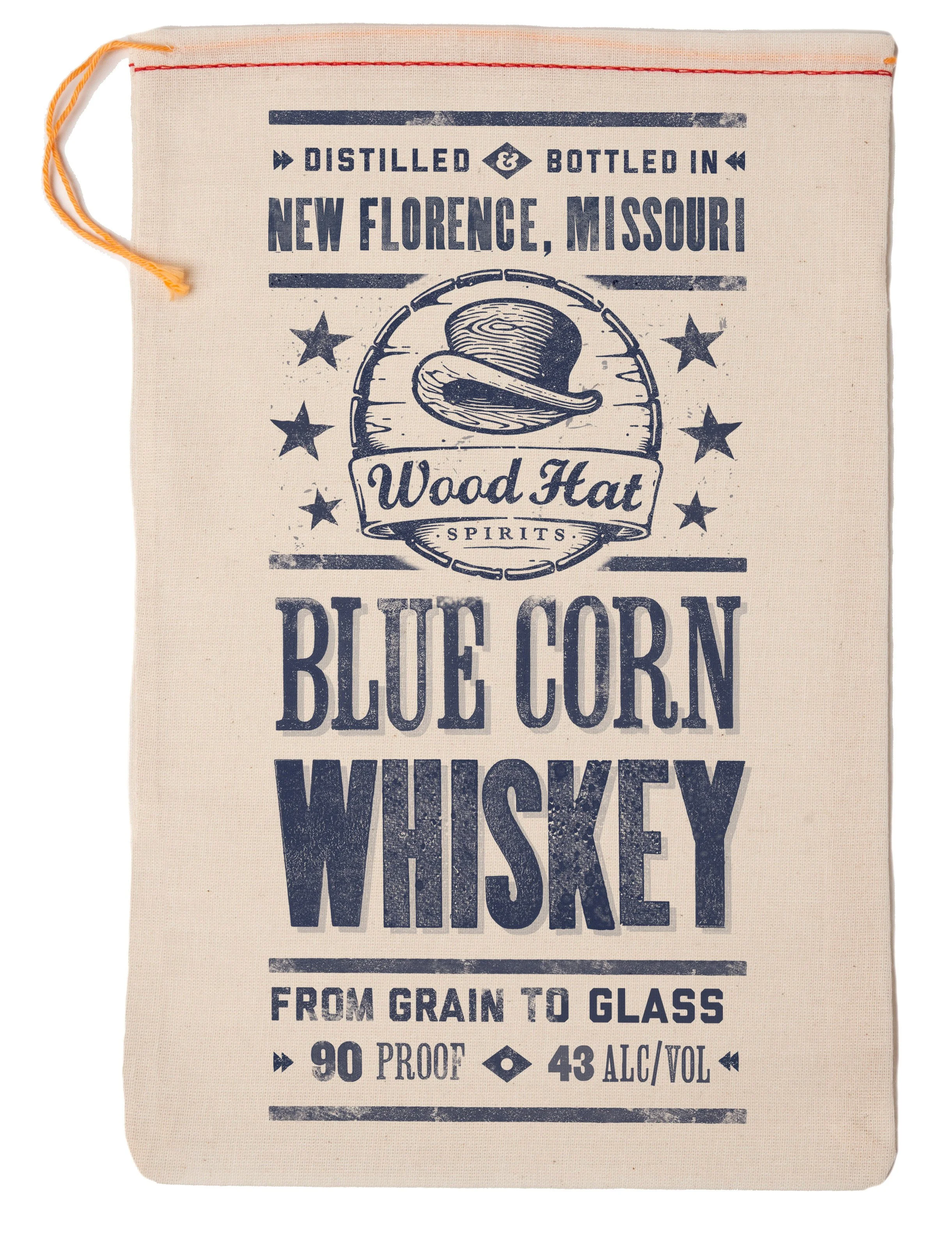
Woodhat Spirits is a brand new distillery located in New Haven, Missouri specializing in the production of blue corn whiskey and flavored vodkas. The label concepts shown here speak to the upscale and gentlemanly qualities of the Woodhat Blue Corn Whiskey product while implying an award winning tradition with the ribbon design. Ultimately, the tail portion of the ribbon design would be made of printed paper in final production, but the original concept was designed to have an actual fabric ribbon pasted under the label to add a 3D element to the piece that would help it stand out on the store shelf. Additionally, the ribbon pattern and color are meant to change based on the product to create a design system for the product labels that unifies the brand and builds cohesion across products.
In an alternate concept, I approached the design from a different angle, referring to corn whiskey’s moonshiner roots by utilizing a letterpress look that speaks directly to the handcrafted nature of the product. Ultimately, the client preferred the ribbon label.
-----------
Project Scope:
• Label concept & design
Ply Gem is one of the nation’s leading providers of exterior home products, offering everything from siding and stone to windows and trim. Each year at the International Builders’ Show in Las Vegas, the brand showcases its full product portfolio through an immersive, large-scale trade show experience.
The 100’ x 100’ booth was designed as a series of full-scale home vignettes, highlighting real-world material combinations and architectural styles. The space featured interactive remodeling displays, hands-on product demonstrations, large structural gathering areas, and a dedicated “ProTalk” stage for industry insights and trend discussions — creating an environment that blended education, inspiration, and an approachable “at-home” feel.
-----------
Project Scope:
•. Concept ideation
•. Color palette and material selection
•. Vendor coordination & support
•. Technical design
In the foodservice industry, Mission Tortillas set the standard by which other tortilla brands are measured. Their commitment to quality and authenticity of product is what the brand stakes its reputation on and what customers have come to expect. With this in mind, Mission wanted to refresh their brand ads while strategically targeting three specific audience markets: general audience, college and university, and hotel and lodging.
Conceptually, the focus was to develop a look that could capture the authenticity of the Mission product and a voice that could exhibit the swagger of a superior quality tortilla. The result is a type-driven campaign centered around weathered painted stucco surfaces, awesome headlines, and beautifully plated food photography. Overall, the campaign dovetailed nicely with other brand initiatives and created one of the company’s most memorable and successful campaigns on record.
-----------
Project Scope:
• Campaign concept
• Campaign design
Logo design plays a central role in defining a brand’s identity. My approach is rooted in an informed, research-driven process that connects strategy, culture, and business goals — helping move decisions beyond pure subjectivity and toward purposeful creative solutions.
I’m drawn to the challenge of logo design because it demands precision, clarity, and restraint. It’s one of the most complex — and rewarding — disciplines in graphic design, bringing together concept, typography, and visual storytelling in a single mark.